Mismatches between GCM and CPM
While working on a baselines for my high-resolution precipitation emulator, I found that at some time steps there was a large discrepancy in the spatial distribution of the most intense rainfall.
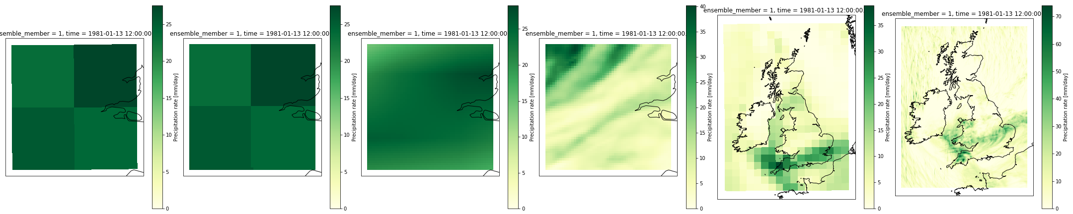
I first noticed this when testing my baseline against the wettest days in London (so aggregating over 4 60m grid squares) but a similar phenomenon is present when looking at wet days nearer the median (so snapshots with at least 0.4mm/hr precipitation intensity for the day when summed over all 4 GCM grid boxes). This is all just for one ensemble member (01) from UKCP18 data from 1980-12-01 to 1982-11-30 in GCM and CPM.
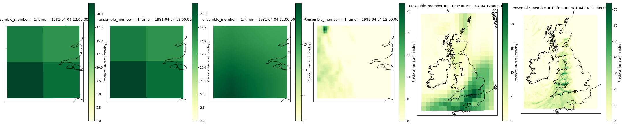 Notice for the two panels on the right the blocky GCM one puts heaviest rainfall over South East but high-resolution CPM projection puts heaviest rainfall over Wales and South West of England
 Notice how for left-most GCM data suggest NE London will be wettest while the CPM in 4th panel suggests NW will be wettest.
 Notice how for left-most GCM data suggest NE London will be wettest while the CPM in 4th panel suggests NE will be driest. The UK-level plots also seem to disagree with CPM looking drier over Wales and off NE-coast of England unlike in GCM.
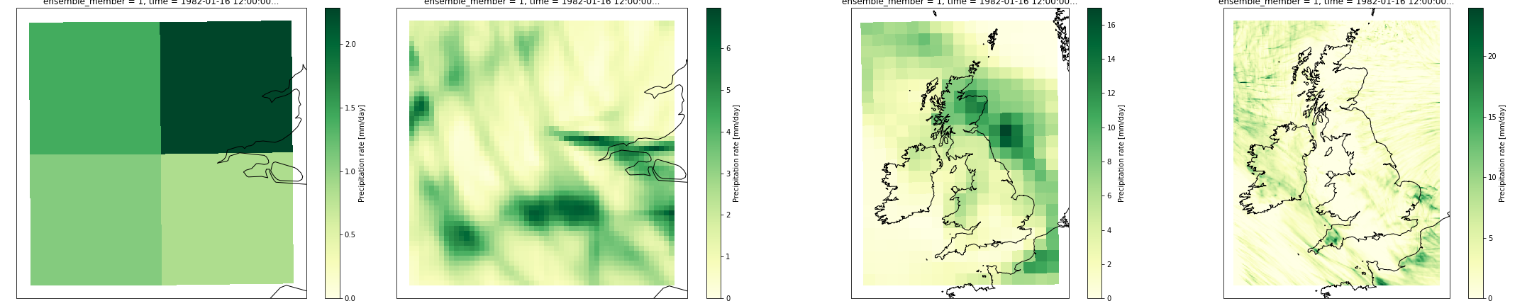
What I had not realised is how much scope where was for different precipitation to change, via processes like fronts rotating, as the simulations go from GCM via Europe RCM to UK CPM. Therefore it is quite reasonable for the CPM to report heaviest rainfall in the South East of UK while GCM projects it to be in South West for a given day.
On another note, I’ve been experimenting with different colour maps. The default one used by xarray is viridis which uses blue to denote small values but blue might also be interpretted to mean wet (i.e. high values). Not sure this Yellow-Green one is the answer, however.